Typesetting with Expression
In traditional typography, the objective has usually been to present the text in as elegant, legible, and efficient a way as possible. Typographic styles have historically reflected the conventions of the time period more than they have the content of the text.
But since the start of the 20th century, artists and designers have experimented with ways of using typography expressively.
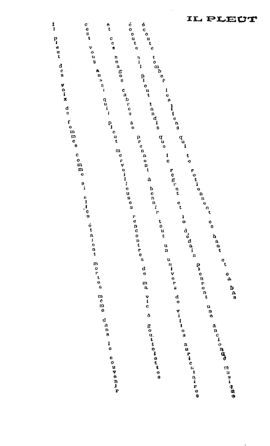
In 1916 for instance, the French surrealist poet Guillaume Apollinaire published this concrete poem. The poem is about rain and its typographic form expresses this as much as its content does.
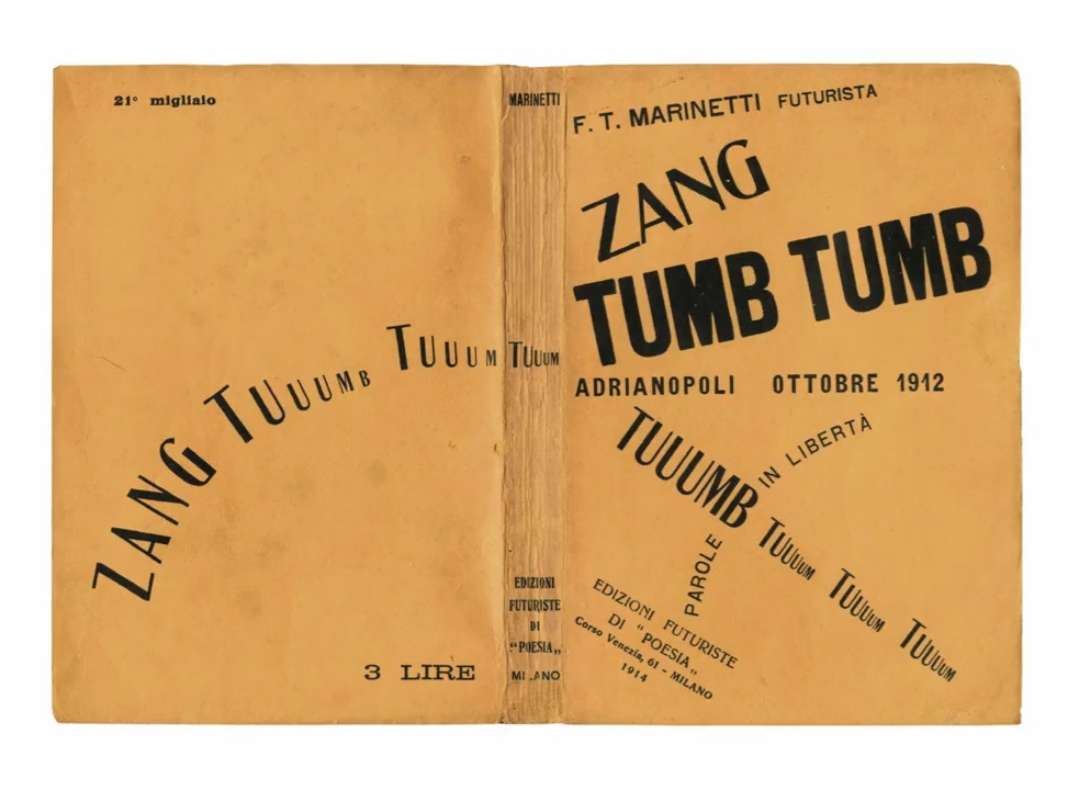
This book from around the same time by the Italian futurist Felipo Marinetti sets out to capture a visceral sense of war through dramatic typographic compositions.
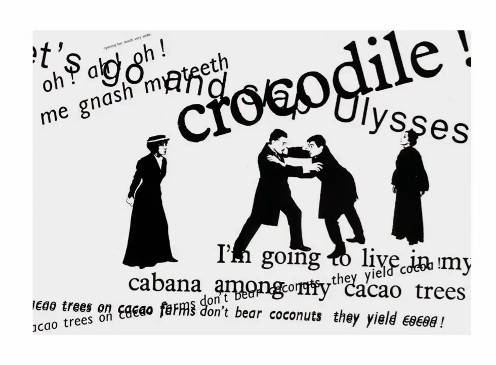
And in this book, a mid century typographic interpretation of a play by Eugene Ionesco , typographic compositions express the tone and pace of the dialogue progressing from subdued to frenetic.
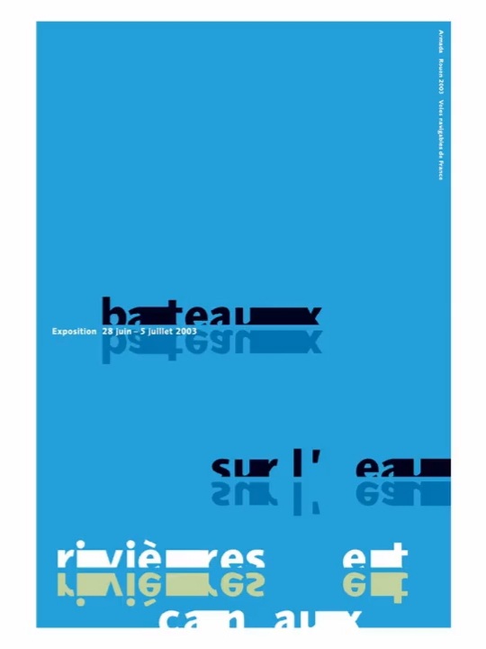
We can create a composition that suggests horizontal movement, like in this poster about canal boats, conjuring up the slow movement of the boats along the water.
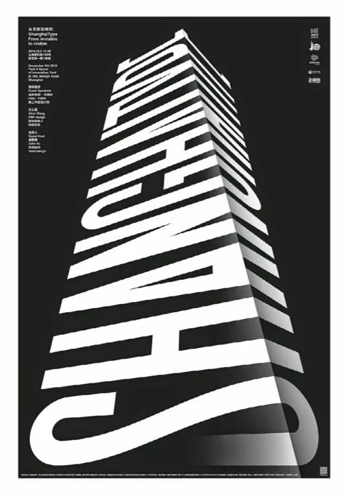
Or a composition that feels vertical, like in this poster for a conference in Shanghai, a city know for its skyscrapers.
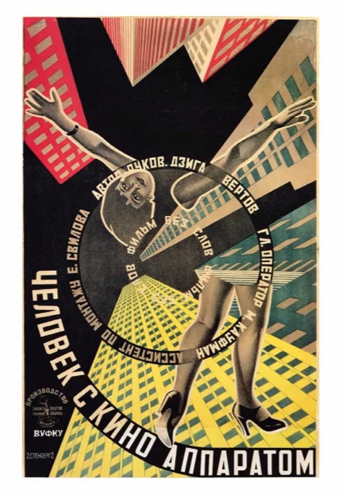
Here in this poster from the 1920s the vortex gesture expresses the dizzy feeling of being in the bustle of a modern city.
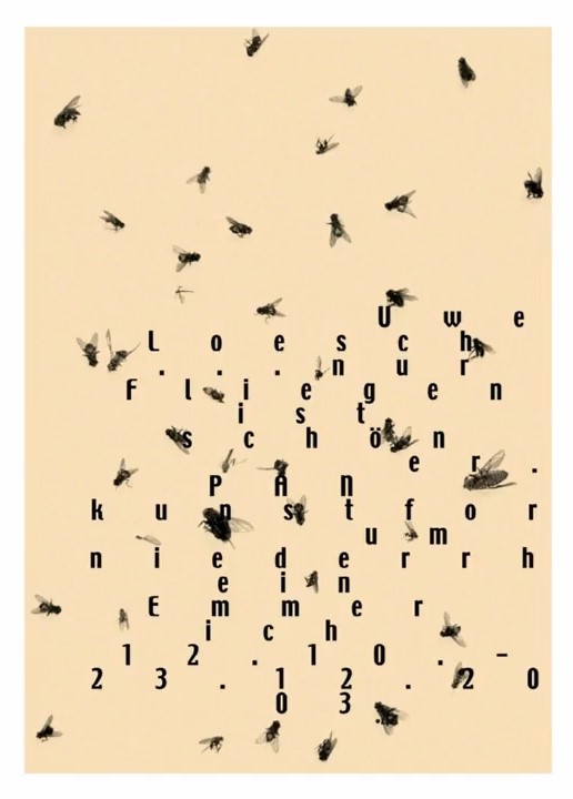
And this composition that is random and scattered, perhaps suggesting chaos or something organic, like these flies.
Or in the opposite extreme, we can create a gridded and orderly composition like Armin Hofmann, the mid century Swiss designer, has done in this poster about formal principles.

There's no formula here for exactly what compositional gesture or what typographic style will best express a particular meaning. But that doesn't mean that designers are off the hook. Typography is always about communication and a piece of expressive type is only successful if it is able to clearly convey its intended message to an audience.