Beyond Typesetting
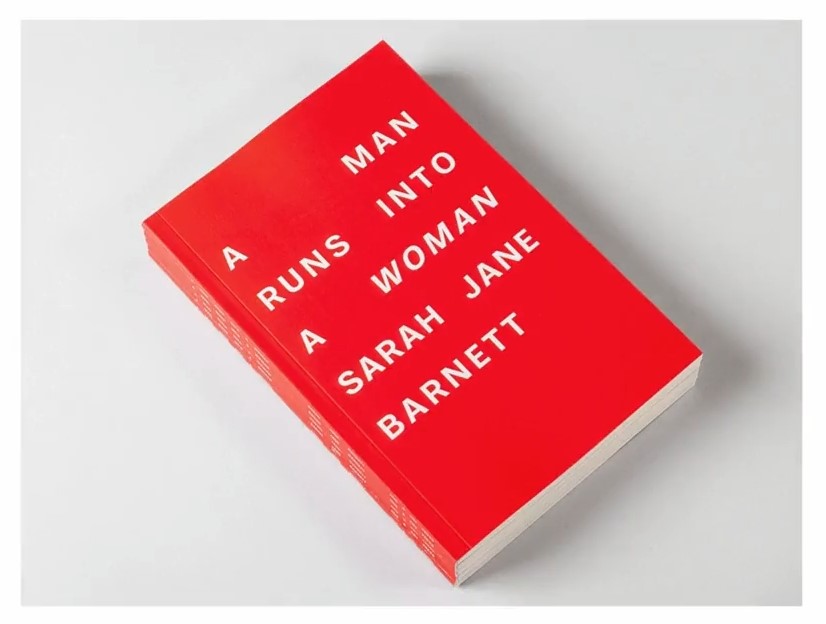
We can also go beyond conventional typesetting altogether and approach type not as text to be typeset but as formal material to be composed, manipulated or rendered in any number of ways. Sometimes, breaking a rule of typesetting in a controlled way can be poetic. In this book cover, for instance, the designers have created uneven spaces in the title, arranging the words in a way that draws attention to the symmetry between a man and a woman.
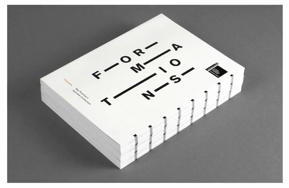
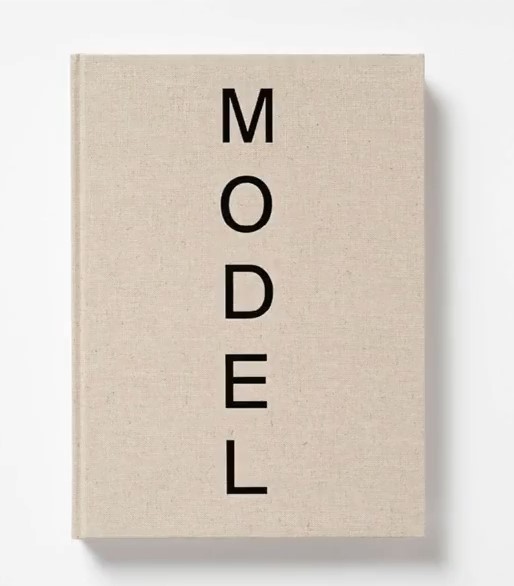
In this cover for a book on architecture, the title is broken up with stretched dashes, turning it into a shape reminiscent of an architectural structure. And in this cover, for a book on the British sculptor Antony Gormley, the letters of the title are stacked vertically, referencing the formal characteristics of Gormley's vertical steel sculptures.
Breaking the Rules
Beyond breaking rules like this, designers can also manipulate the forms of the letters themselves.Armin Hofmann often manipulated or arranged type to create compelling abstract forms in his posters.
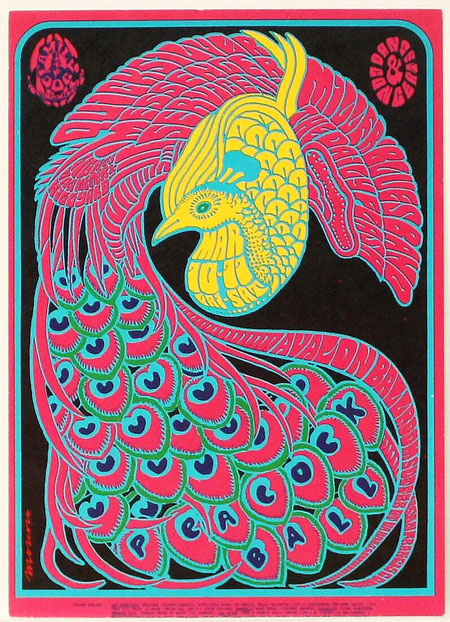
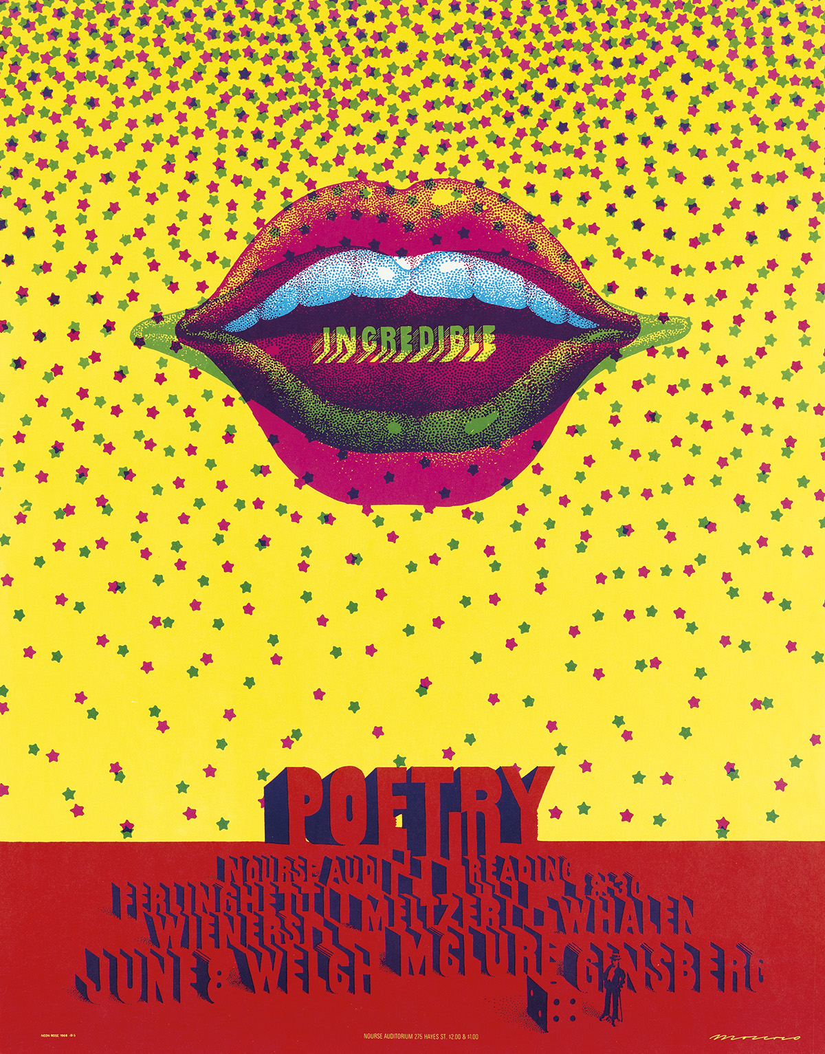
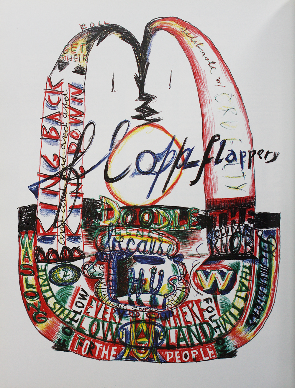
In the 1960s designers like the Spanish American Victor Moscoso used really abstracted type in their event posters, demanding that readers spend time actively decoding their messages.
And this visual strategy mirrored the dense and opaque style of the psychedelic music that these posters were advertising. These days we can directly manipulate the vector lines of type in design software.
Technology and Modern Tools
The technology of reproduction can also inspire typographic experimentation. In the 1990s, the American art director David Carson created the distinctive typographic style for Ray Gun Magazine by cutting up type and layering it with a Xerox machine. The rough, scrappy aesthetic captured the feel of the grunge music documented in the magazine.

Modern screen based media can be a little rough around the edges, too. And in contemporary art and design there's a fascination with digital glitches. These are typographic illustrations for Wired magazine by the British typographer Craig Ward.
But of course type has its origins in human handwriting. And many typographers have returned to the hand as a way to infuse type with human expression.

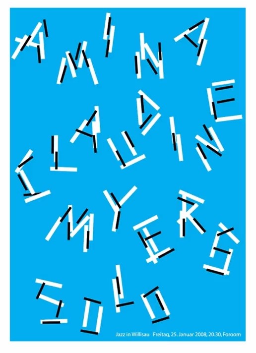
The Swiss designer Niklaus Troxler, for instance, is well known for his posters for jazz music events, many of which used hand lettering to capture the loose, improvisational character of the jazz music.
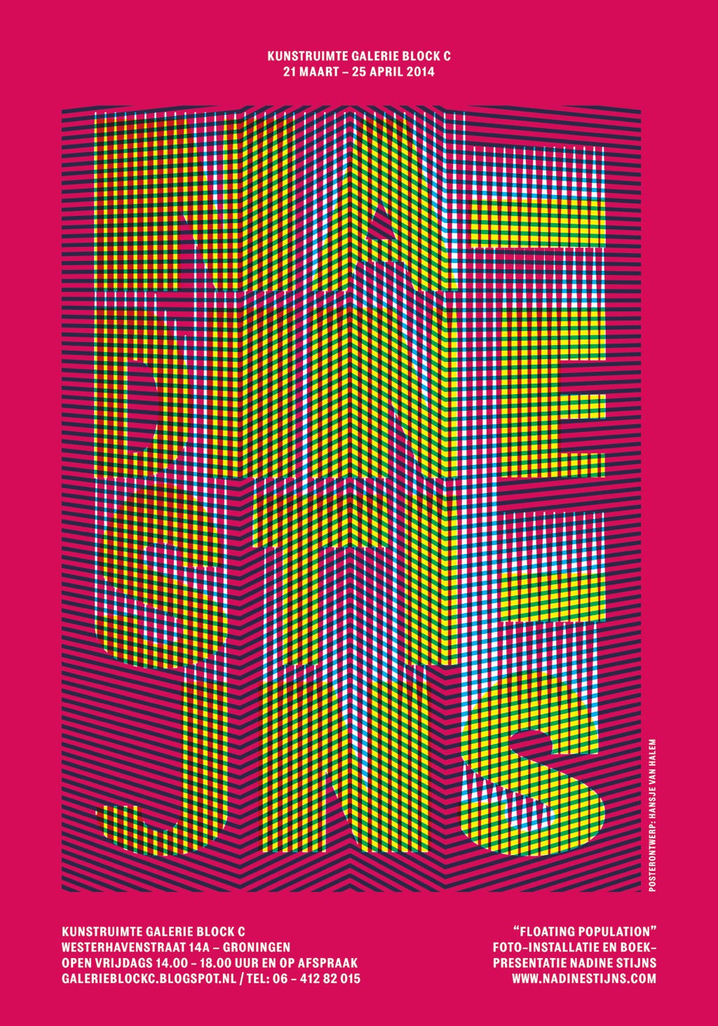
In contrast to Troxler, the typographic work of the Dutch artist and designer Hansje van Halem is painstakingly detailed and ornate, while still feeling organic.
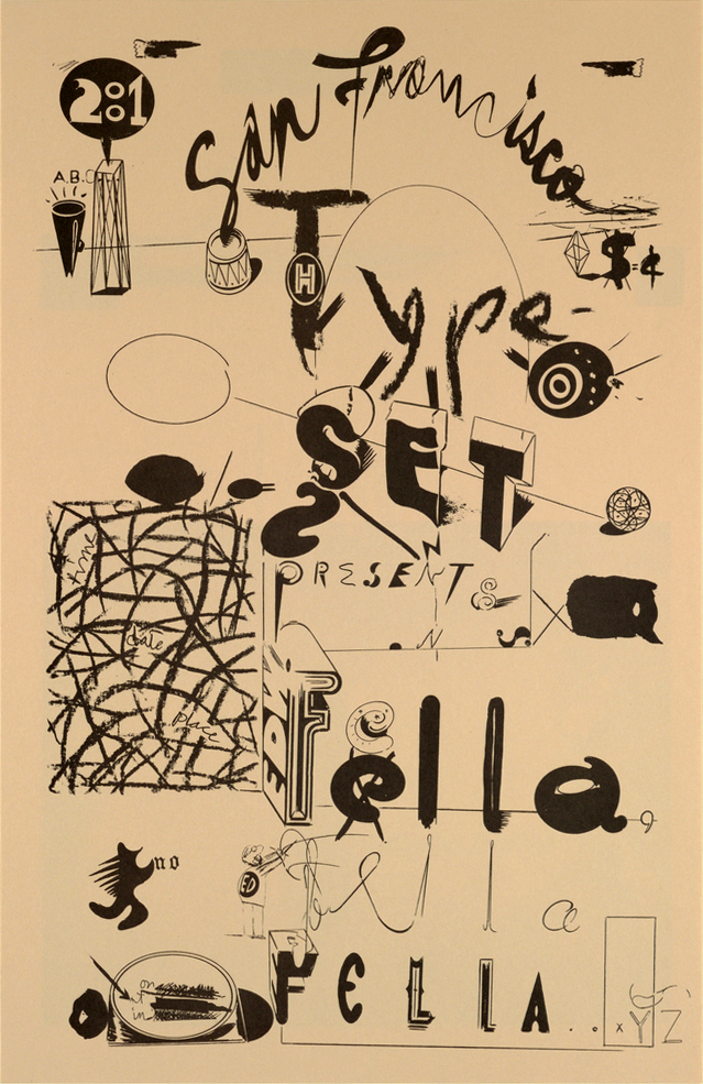
The American artist and designer Ed Fella is known for his eccentric hand drawn interpretations of American vernacular typography. Today we designers have so many tools at hand, digital and analog, that we can make type out of just about anything. Paul Elliman, a British designer and artists makes typefaces out of found objects.
Craig Ward uses a mixture of photography and digital software to create exotic type treatments that dramatize their subject matter.
The Dutch poster designer Mihail Sherman creates spectacular abstracted typography using digital software.
In a lot of this kind of work type moves from being a flat mark on the page to being a tangible thing. And some designers have pushed this to its limit, taking type off the page all together and into three dimensional space.
This is a series of typographical experiments by the Austrian designer Stefan Sagmeister. The conceptual artist Jenny Holzer brings type into space in a different way, by projecting it at large scale onto it's surroundings. In her work there's often a fascinating dialog between the typography, and its physical environment. Not all of these examples will be relevant to your work. But I hope that it will show you the breadth of what's possible with type. And encourage you to think beyond the conventions of classical typography.