Typefaces and their stories
Typeface's suitability for a particular use is determined not only by its functional characteristics, but also by its connotative meaning.
No typeface is a neutral transmitter of content. All typefaces carry associations, whether explicit or implicit. Typefaces tells stories, and those stories are often complex and multi-layered.
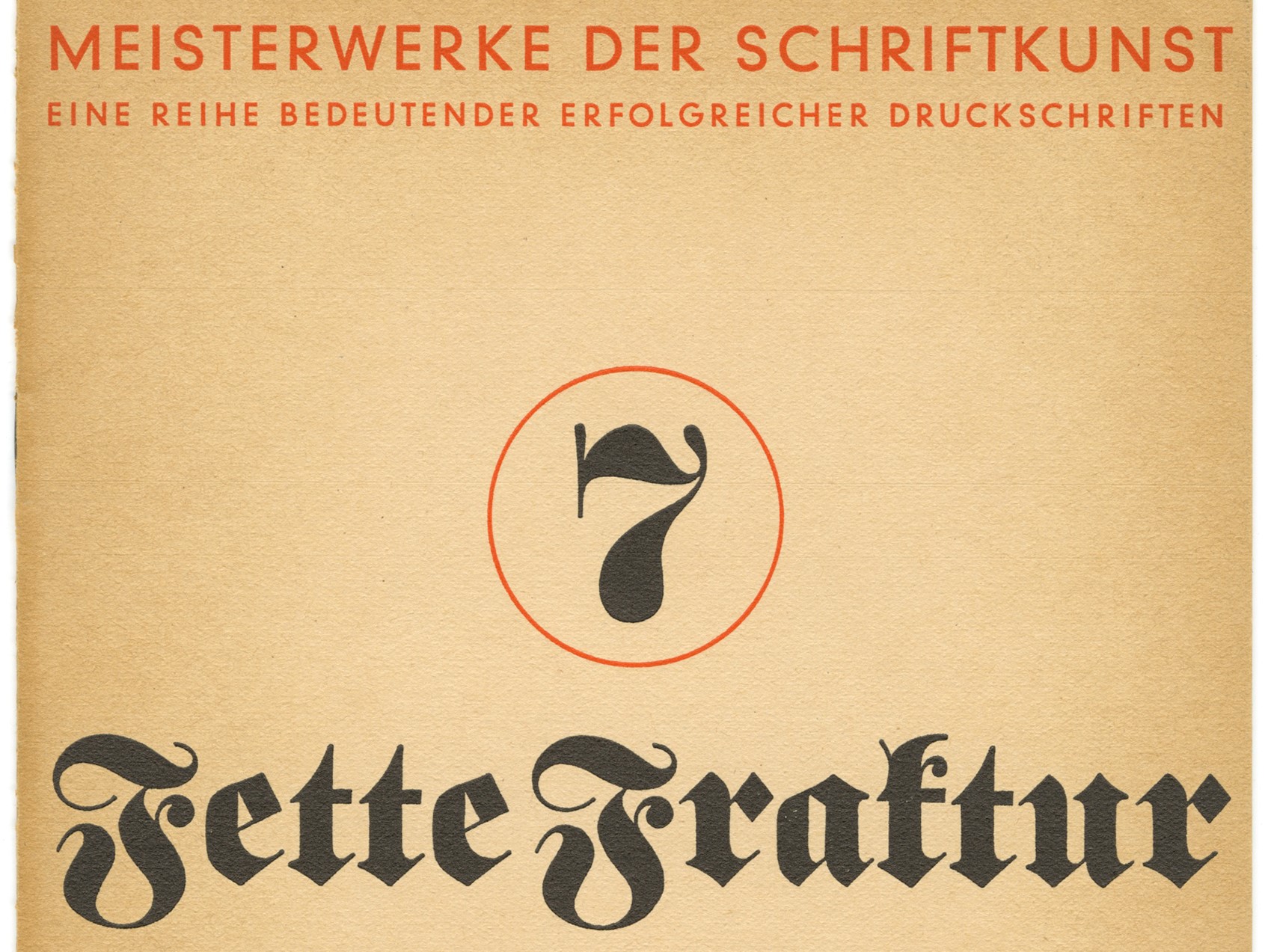
Take for example the typeface, Fette Fraktur . It was designed by a German in the 19th century to reference a handwriting style from the Renaissance. But in the 20th century, it became associated with Nazism. And after the war, it stopped being used for this reason.
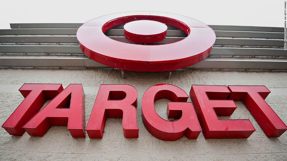
Or Helvetica, a typeface designed in the 1950's with the valid intention of being completely neutral, but which ironically has become a loaded signifier of American corporate culture and a flashpoint for debate amongst designers.
As typographers, it's our job to be aware of and be able to sensitively leverage these stories when we choose and use type to enhance our nuance meaning in our design. To become truly fluent in typographic connotation takes time and experience, but the best place to start is by looking at the history of type.