BEMBO: HUMANIST LETTERS
Before Johannes Gutenberg introduced movable type to Europe, books were handwritten by scribes, many of whom worked in monasteries. These books took a lot of skill and labor to produce. They were rarefied, valuable objects, and marks of prestige for their owners. When Gutenberg developed his system of movable type in 1439 and began printing and selling books, it made sense for him to try to simulate the look and feel of these handmade books as closely as possible.
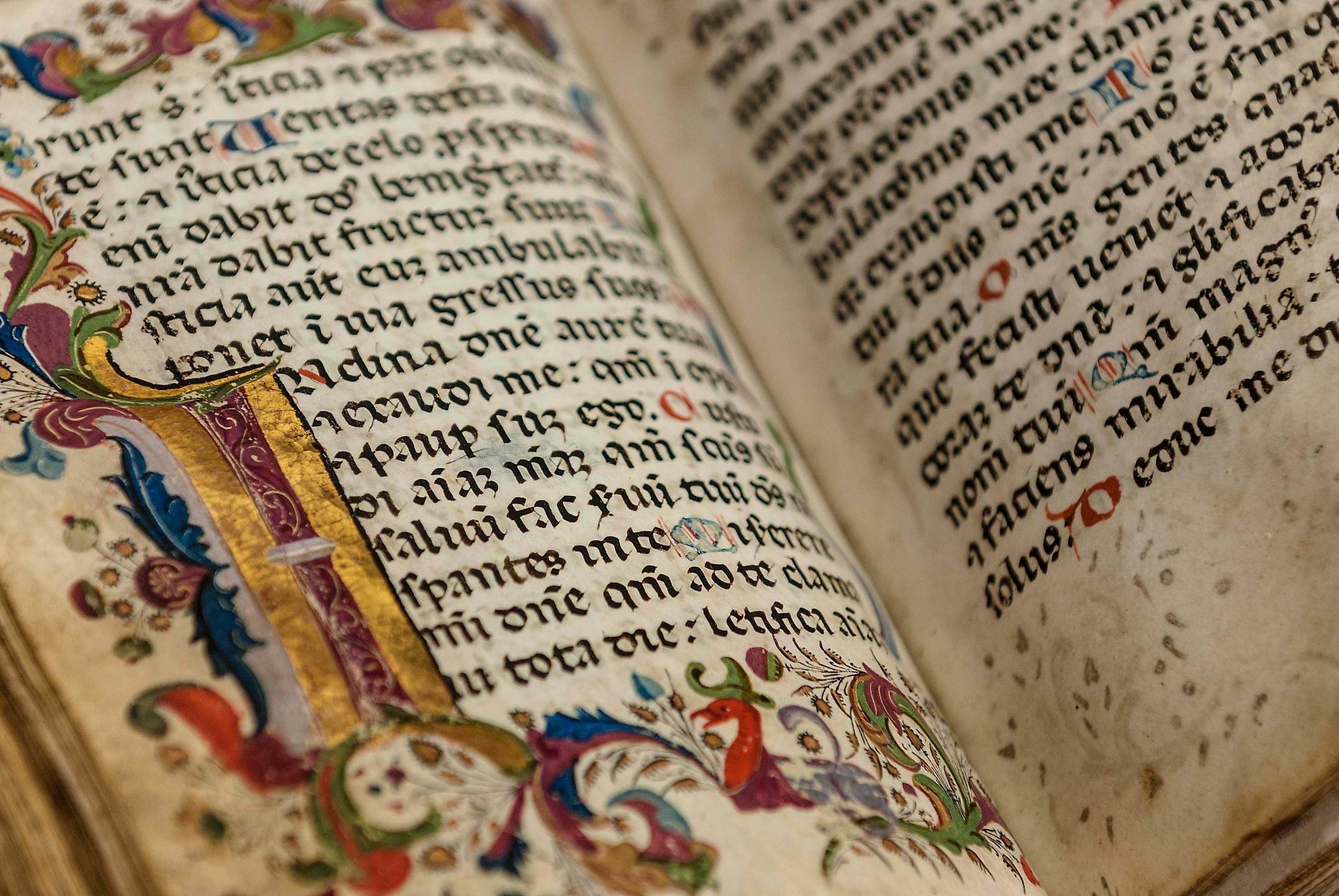
So his early typefaces imitated the handwriting style of scribes in northern Europe. This style was called the Black-letter and it remained popular in parts of Europe into the 20th century.
In the late 1400s, printing technologies started moving south from Germany to Italy and especially to the prosperous port cities of Venice. Type designers, or punch cutters as they were called because they carved the letter forms at actual size into the punches used to cast type, started making type that imitated the writing style of southern European scribes. This writing style was called Humanist Minuscule, or just Roman Script.
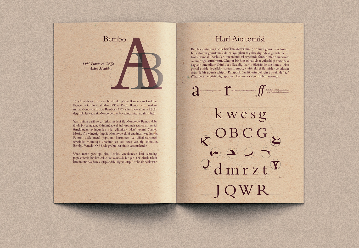
The most influential figure in the Venetian printing scene was Aldus Manutius, a publisher who ran a press called the Aldine Press. Manutius was the first publisher to successfully produce books cheaply and in large quantities for more mass audience, rather than just for elite customers. In around 1495, Manutius commissioned a prominent punch cutter, Francesco Griffo, to create a type face for his press, and the result was what we now call Bembo.
The Modern Era
Digital versions of bembo actually originate from a redrawing of Manutius' design by the American type designer, Stanley Morrison in the early 1920s. The name is taken from a book of poetry by Pietro Bembo in which Griffo's typeface was first used. In Manutius' this day, books were printed on expensive vellum, animal skin, rather than on paper, in an effort to save money by cramming as much text onto each page as possible, Manutius also commissioned Griffo to draw one of the first italics.

Italics
Italics were based on another, less formal style of southern European script. If you carefully compare an italic typeface to a Roman typeface, you'll see that there's a lot more difference than just the slanted angle. The shapes of the letters themselves are actually quite different. And in fact, italic type was not initially designed to go together with Roman type. That only happened later. Early Roman style typeface is from the 15th and 16th century like Bembo are often referred to old-style serif typefaces. This style is characterized by a strong calligraphic flavor. Because of their age and their association with books, we tend to associate typefaces like Bembo with literature, classicism and the Middle Ages.