Stroke and Proportion
What really define the character , the look and feel of a typeface on actually use is not it's details but some overall qualities of stroke & proportion , and these qualities are what typographers pays most attention to when they're are looking at types. The forms of the typographic alphabet emerged from scribes' handwriting in the 15th century. So the lines that form letters are called strokes and are based on calligraphic marks.
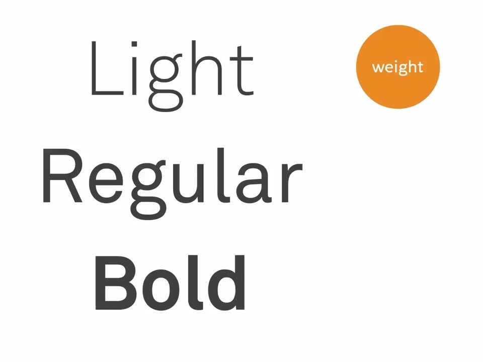
Weight is the thickness of a stroke, and this varies between typefaces and also within type families. Stroke weight contributes to the type's color, how dark or light it appears when set in text. Stroke modulation is how much the thickness of the stroke changes in different parts of the letter.
In traditional calligraphy, the brusher pen is held at a constant angle as the letters are drawn, creating a stroke with a lot of modulation. The modulation of a stroke implies a tilt or axis to the letterform. In more calligraphic typefaces, this axis is usually angled and in more mechanical typefaces it tends to be vertical.
In humanistic typefaces, strokes often end with a little wedge-shaped form called a seraph The presence or absence of serifs divide all typefaces into the categories of serif and sans serif. Sans from the French, meaning without. And these two styles have quite different textures on the page. Some designers argue that serifs make type easier to read by creating an imaginary line that the type sits on, and that guides our eyes along each line of text. And for this reason, serif type faces are conventionally seen as more appropriate for long bodies of text.
Proportions
Besides qualities of stroke, the overall appearance of a typeface is also determined by its proportions. Some typefaces have narrow and tall condensed letter forms, while others have squat and wide extended forms. That small scale condensed type on the left looks blocky and dense, extended type looks kind of airy.
Another important proportion is what might roughly be described as the size relationship between lowercase and uppercase letters. And this is called the x-height of the typeface. The x-height is the imaginary line that defines the height of many of the lowercase letters. Typefaces with a large x-height with a proportionally larger lowercase letters, like this typeface, look bigger and more even on the page. Typefaces with a small x-height with proportionally smaller lowercase letters look smaller and more delicate.