Type Anatomy
Although the details of individual letter forms are usually invisible at small scale, it's still important to look at letters up close. And to be able to identify and describe their features. The two fundamental visual elements of a letter form are the stroke, the black part of the letter, and the counter, the white part.
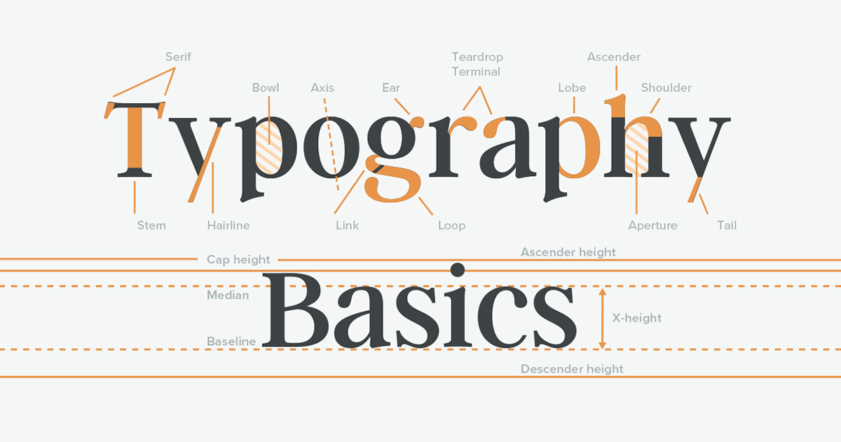
Because the counter is often bigger than the stroke some typographers argue that when we read type at small scale we actually are recognizing the counters of the type rather then the strokes. Roman letter's have been around for a long time so there's a lot of esoteric terminology for describing their different parts.
The main vertical part of the stroke is called the stem. The end of a stroke is called the terminal. This rounded kind of terminal is a lacrimal and this kind is a spur. The rounded counter is found in some letters are called the bowls. Many of the parts of letters are named after parts of the human body. This is a leg. A shoulder.
Horizontal Lines
All letter forms are constructed in relationship to a set of invisible lines or metrics that define their proportions.
The x-height, which we've already discussed, defines the height of the main body of lowercase letters. Any part of a lowercase letter form that extends above the x-height is called an ascender. The baseline is the line on which the letters sit. Any part of a letter form that extends below the baseline is called a descender. In many typefaces, uppercase letters are actually slightly shorter than ascenders. So their height is defined by a cap-height metric.

Curved parts of letters actually extend a little bit above and below the x-height and base line. And this is because from a distance our eyes see circles as smaller than squares. So curved elements are made larger to compensate.