DIDOT: ENLIGHTENED REFINEMENT
In this case study we're going to look at a typeface designed 300 years after Bembo, in the late 18th century, the late 1700s. It's a design that today is known as Didot.Typefaces like Didot are called Didones or modern serifs. They're seen as the last stage in a long evolution of traditional Roman book typography. From humanist typefaces that closely imitated handwriting, like Bembo, to rational typefaces that no longer showed any trace of the human hand.
Modern serif's have a perfectly vertical axes.Very thin, entirely unbracketed serifs. Serifs with no curved connection to the stem. An strong modulated stroke that is really thin in some places, and much thicker in others. The evolution from humanist Renaissance type to these very stark and mechanical forms paralleled and reflected the ideas of the European Age of Enlightenment. In 18th century philosophy, politics, and literature, there was a new interest in empiricism, rationality, and scientific rigor. And type designers were starting to reflect these values in their designs.
The first true rationalist typeface was the the Romain du Roi, the King's Roman. It was commissioned by Louis XIV in 1692 to be the official typeface of the Royal French Print Office. And it was designed by a committee of designer's and engineer's rather than by a traditional punch cutter.the letter forms were derived from a mathematically precise grid rather than the organic forms of handwriting.
It's also significant that these illustrations of the type are engraved rather than letter press printed. Engraving and etching were illustration techniques popular at the time that allowed for the printing of very precise fine lines. And in the 18th century, type designers and printers pushed their craft to try achieve this fine line aesthetic in letter press printing.
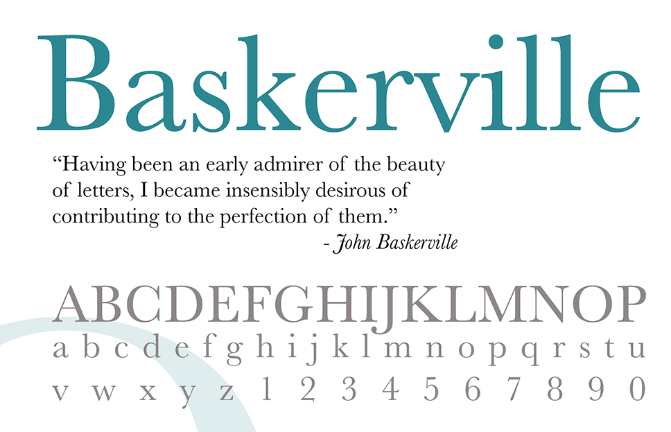
One particularly innovative printer was an Englishman, John Baskerville. He developed innovations in paper and ink making that allowed him to design and print typefaces with much more delicate strokes. In 1757, he designed the typeface Baskerville. Baskerville is known as a transitional serif. It's roughly half way along the evolution from old style to modern serif.
Transitional serifs have a vertical axis, more modulation than an old style serif, but still bracketed serifs. 40 years later, these trends towards rationality and mechanicalness matured in the work of Firmin Didot , a Parisian punch cutter. Today the most common digital version of Didot's work is a reinterpretation by the 20th century French type designer Adrian Frutiger, and this is the typeface we know today as Didot.
Didot is extremely similar to Bodoni, a typeface designed around the same time by Giambattista Bodoni in italy. Bodoni and Didot were influenced by each other and both of them were influenced by the work of John Baskerville.Because of their thin, elegant and minimal forms Didot and Bodoni were used a lot by American and European fashion publications in the 1950's, sixties, and seventies. And they're still really closely associated with the world and with the aesthetics of fashion.
