FUTURA: THE TYPOGRAPHIC AVANT-GARDE
At the beginning of the 20th century, the western world was changing at a disorienting pace. Cities were continuing to expand, railways, airplanes, and automobiles connected people everywhere, telegraphs and telephones allowed for instant communication, economies boomed, and wealthy western countries aggressively projected their might abroad with newly high tech militaries. And in 1914, all of this came to a catastrophic head in the outbreak of the 1st World War.
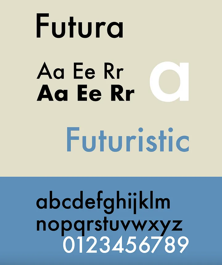
In the world of fine art, movements like cubism, expressionism and later futurism and constructivism, responded to these changes by rejecting and deconstructing traditional modes of representation. And reconfiguring the building blocks of color and form to try to express the spirit of the modern age. In the 1920s, designers applied this new approach to type design. And the result where typefaces that made a really radical break from the 400 year evolution of typographic form so far. The most successful of these typefaces was Futura, designed in 1927, by the German type designer Paul Renner.
In the 1920s, the practice we know today as graphic design was in its early nascency. Early practitioners of graphic design, like the Hungarian painter and photographer, Moholy-Nagy, were constructivists. They advocated a rational functionalist approach to design, which aimed to strip typography of its historical mannerisms and decorative elements, and to use the fundamental properties of form, color and structure to effectively communicate.
A New Typography
In 1928, another influential German designer, Jan Tschichold, summarize the principles of constructivist design as applied to typography in this book, The New Typography. Amongst other things, Tschichold advocated for the use of sans-serif type rather than traditional serif type. He argued that sans-serifs were more functional and less decorative than serifs and were therefore more appropriate to the modern age.
Working at the same time as Moholy-Nagy and Tschichold, the type designer Paul Renner sought to apply the ideas of constructivism to type design. He deconstructed traditional letter forms into simple geometric shapes and the result in 1927 was Futura. Futura developed out of a process of experimentation. Renner began with really radical and strictly geometric forms.
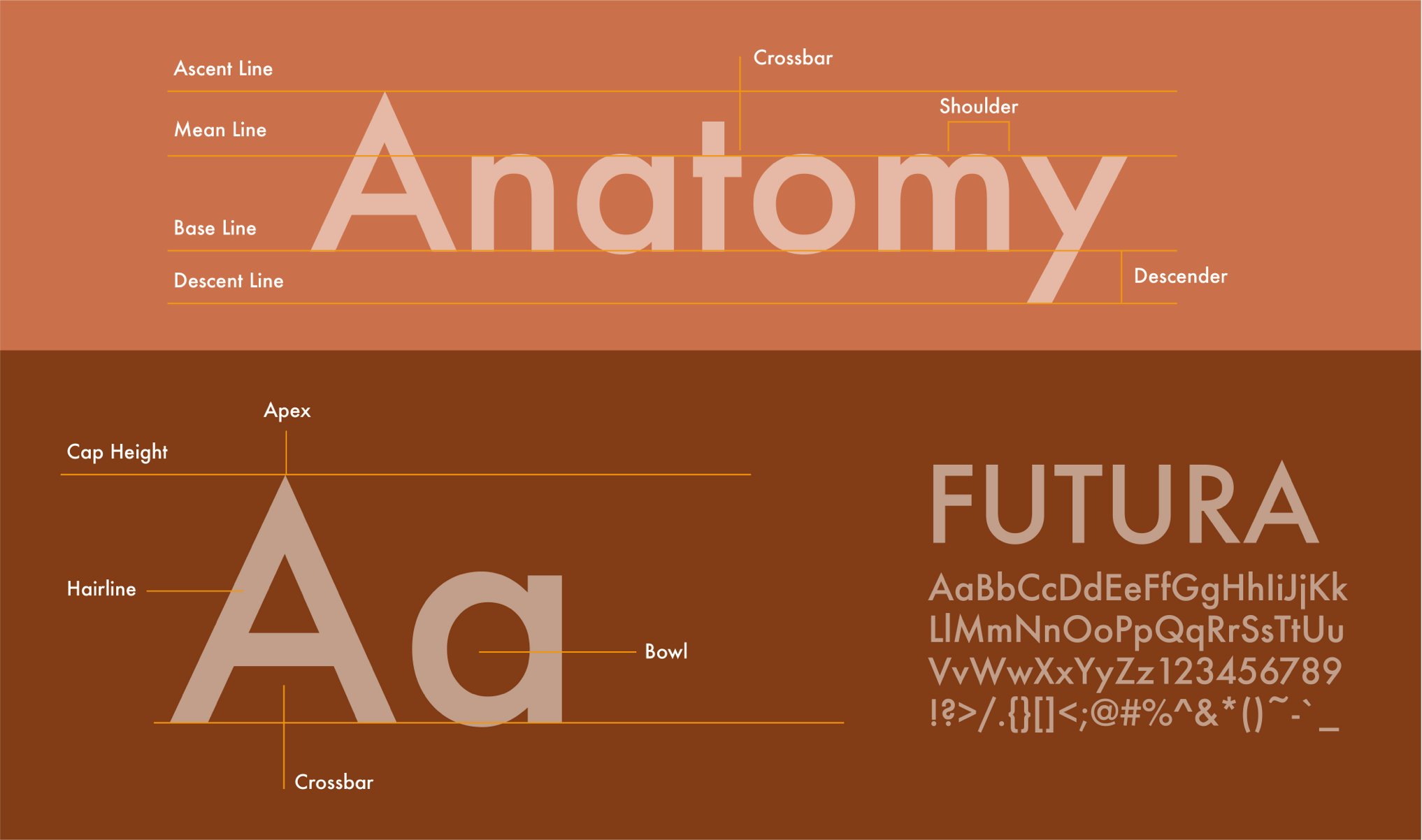
But as he developed the typeface, he made compromises with the visual conventions of traditional type. For instance, he pinched curved strokes where they intersected vertical strokes, to avoid creating dark areas at the intersections.
Minimalism
Typefaces like Futura that use minimal geometric forms are called geometric san-serifs. These typefaces generally have an apparently circular O, an almost entirely unmodulated stroke, and letter forms that have been simplified to dispense with many of the traditional features. Such as the tail of the t or the hooked top part of the traditional lowercase a.
Because of its minimal almost childish forms, we today associate Futura with simplicity, transparency, and sometimes naivety. But also, with the particular context from which it emerged, early European modernism. This is the Bauhaus School is Dessau where Moholy-Nagy taught and which is often seen as the cradle of European modernism.
